The sugar high of Halloween has not yet begun, let alone dissipated, and yet the holiday season is upon us ladies and gentlemen. Black Friday articles are up earlier than ever and holiday gift guides in October don’t so much as raise an eyebrow. This is our reality and it’s time to make the most of it. As you scramble to throw together the gift guide of the century, check out 5 ridiculously cool gift guides that graced our presence in 2016—and what we loved about them— picked by your very own StackCommerce Content Team.
Katy’s Picks:
The Verge Holiday Gift Guide 2016

Why I Loved It:
Apart from the fact that this guide is freaking amazing to look at, The Verge delivered a welcome departure from the typical persona-driven gift guide formula. Rather than breaking up gifts according to the usual suspects (e.g. Gifts for Soccer Moms, Gifts for the Man Cave, Gifts for Besties, etc.), they focused in on where and when a gift might actually be used. Interesting, right?
Friends with a bunch of homebodies? Buy them something to use at home. Shopping for coworkers? You might (choose to) know absolutely nothing about them, but you’re positive they come to work every day. Buy them something to use at work!
By taking the road less followed, The Verge’s guide becomes not just another gift guide, but a totally fresh resource for shopping the season.
Refinery29 Gift Curator

Why I Loved It:
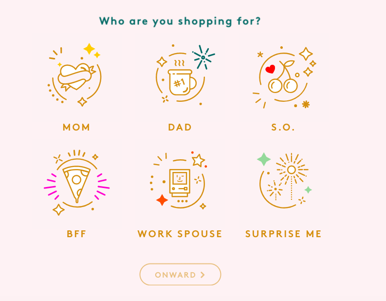
There are two universal truths we can all agree on: holiday shopping sucks and people don’t read. Agreed? Great. Refinery29 took that to heart and made a unique gift guide experience that renders both those things insignificant.
Firstly, their interactive gift guide handholds you through the gifting process like a “Which Friends Character Are You” Buzzfeed quiz. It’s pleasant, engaging, and best of all, easy. Once you graduate from the questionnaire phase, you’ll land on a clear list of gifting options, curated specifically for your shopping list. The large, clear on-white imagery and single sentence descriptions are just simple enough to work. Thank you Refinery29, for the gift of easy gifting.
Nick’s Picks
CNET’s Holiday Gift Guide 2016

Why I Loved It:
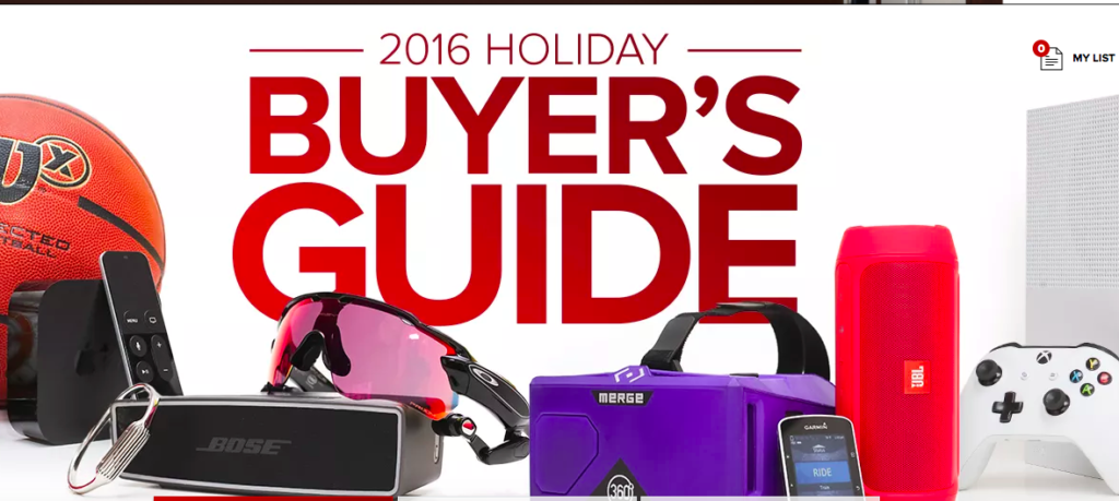
They say content is king, and CNET takes that idiom to heart with this gift guide. Their content-driven guide adds one more wall before getting a customer on an actual sale page, but it also invites them to browse a much larger inventory, while still catering to their personal preferences. Better yet, if you really do just want to scan products rather than read a full post, CNET provides a “Gifts” button that opens the article’s featured deals in a slideshow format for you to preview without leaving the main Buyer’s Guide page.
You could very easily fall down the shopping rabbit hole in the CNET Buyer’s Guide, and that’s exactly how you want a gift guide to be.
Consumer Reports

Why I Loved It
Unlike CNET, CR opts for a far more basic design which befits their no-frills style throughout the rest of the year. While it’s a basic guide, it makes a lot of sense. They have a smart, quick intro to the Gift Guide that reminds the reader that their entire M.O. is to “buy and test all year long, so we can tell you which excel in performance, safety, efficiency, and value.” In a hot second, they’ve reaffirmed why you want to look at this guide—they’re true authorities.
Their categories are exceedingly general and don’t always lead to productive commerce articles (See: the entire Food & Drink section) but it’s easy to peruse and maintains a friendly tone that doesn’t try to force sales down your gullet.
The New York Times

Why I Loved It
There are things to love and things to hate about this gift guide. On the one hand, I can’t stop clicking refresh to see the gorgeous multimedia page descend from the snowy heavens into an interactive urban cityscape of clickable gift buckets. It’s an undeniable attractive main page, and while the animations on some of the headings draw your eye, there are too many “Where’s Waldo” elements. If you can find the “Tech” bucket in less than six seconds I applaud you. “Experience” is even cut off at the bottom in such a blatant QA whiff that it cheapens the whole page just a tad.
However, click into any of these buckets and you’ve got a beautiful outlay of just straight PRODUCTS. Each page is extremely friendly to browsing—especially on mobile—with simple product images on white and quick 1-2 sentence descriptions of the product with a subtle, yet still unmissable CTA.
It’s mildly irritating to have to go through the special animation each time you want to review the buckets again, but at least it keeps you in the holiday spirit. The main page may suffer slightly from over-design, but each bucket is practically and purposefully put together for easy browsing, with smart, curated picks leading the lists.

