Upselling or cross-selling customers with relevant products is about more than boosting revenues (although it does that, too). From the user’s point of view, it’s an effortless way to see complementary products without browsing aimlessly. When done properly, upsells can truly enhance the user experience, while simultaneously increasing average order value (AOV) and generating incremental “free” money that the company or publisher would otherwise miss out on. Everyone wins, right?
Unfortunately, not always. Some e-commerce sites make a habit out of constantly shoving upsells in the user’s face, taking away from the user experience and leaving customers with a sour taste in their mouths. Successful upsells start and end with a carefully thought out product selection, but they also require a tactful UX strategy. Bypass common mistakes and read on for my top 3 methods of flawlessly implementing upsells across your site.
Product Page
Across StackCommerce’s 100+ publishers shops, users consistently spend the majority of time on product detail pages, and almost always, this is the first opportunity to provide an upsell to the user.
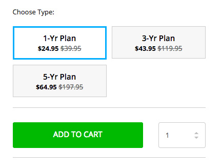
At this moment in the purchase lifecycle, offering a higher priced, upgraded model of the product at hand is beneficial for both user and seller. One strategy is to promote the cheaper version of a product and then provide options for the higher priced versions during the product selection process.
In the example above, the user is viewing the cheaper plan, but is also made aware that bigger discounts are available for longer subscriptions. The options are laid out clearly but not aggressively for the user, maintaining an overall positive user experience.
Shopping Cart
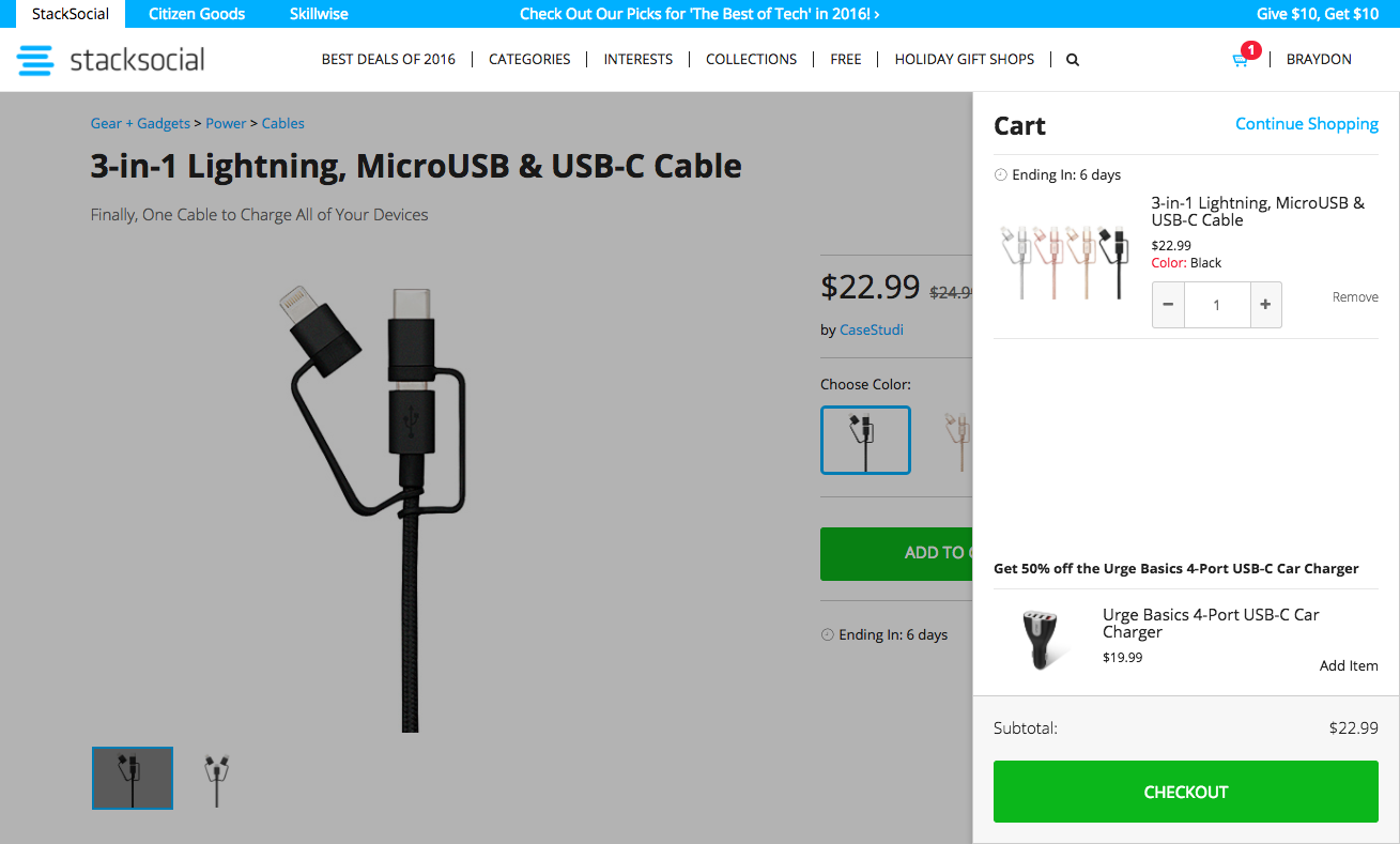
The shopping cart is another great place to offer upsells. A user with an item in-cart has already expressed an intent to buy, and if executed well, a cross-sell can provide a relevant addition to the user’s purchase. Buying a drone? Perhaps the user is interested in a crash pack. When testing cross-sells across the StackCommerce network, the team was shocked at the immediate success of this technique.
To date, this has been our most successful cross-sell placement, and we’re continually enhancing it with improved automated recommendation logic and updated visual layouts.
Note: the cross-sell item remains separated from items intentionally placed in the user’s cart to distinguish it as something different. As with the upsell strategy, the cross-sell recommendation can be easily ignored by the user and does not interrupt the purchase flow. We fixed it to the bottom of the cart nearest the Checkout button for optimal visibility.
Order Confirmation Page
The order confirmation page is one of the most underutilized pages in e-commerce. It’s typically the last page a user views and generally consists of nothing but a simple receipt.
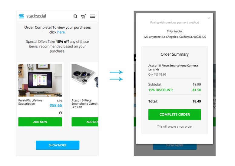
One method for monetizing your order confirmation page is by cross-selling a relevant product with a limited-time discount applied. You may be surprised at how many people are willing to immediately make a second purchase right then and there.
By applying the user’s payment method, you can create a one-click checkout flow on the order confirmation page itself. We offer a selection of relevant products at a discount across the the top of each order confirmation page, all equipped with a seamless one-click checkout solution.
Upsells and Native Commerce
Unlike typical affiliate commerce which redirects customers to a third party e-commerce site and yields a portion of the profits, native commerce branded shops allow publishers to benefit from techniques usually reserved by the e-commerce sites themselves. Upsells and cross-sells are amazing examples of this. With StackCommerce’s platform, publishers are able to seamlessly offer relevant upsells to their readers and collect on an additional incremental revenue stream as a result.
Whether you’re a publisher or e-commerce site looking for new user-friendly ways to monetize, remember that upsells and cross-sells should be implemented tastefully, carefully, and with a UX state-of-mind.


