Quick: How long do you think it took your brain to form an opinion about this webpage?
If you guessed less than two-tenths of a second, please come collect your prize. That’s according to researchers at the Missouri Institute of Science and Technology, who evaluated users’ rapid-fire first impressions and found that they’re often the determining factors in a site’s overall favorability (or lack thereof).
Let’s think about these findings in terms of commerce content. If you want your readers to stick around in the hopes of getting them to make a purchase, there needs to be something on your page that hooks them in immediately — something like a decent product image.
We could write an Odyssey-sized book on all the reasons why it’s important to prioritize strong imagery as part of your native commerce strategy: Compared to its text-only counterpart, visual content is easier for our brains to process, helps viewers better remember your message, and receives tons more views. (In the most basic sense, it’s just more interesting to look at.) But what separates a bad product image from a good one, or a good one from a great one?
We’re glad you asked. Here’s a brief primer on choosing photos for native articles that answers that question and more:
First off, what differentiates commercial versus editorial imagery?
The key distinction between the two lies in their subject matter, as well as the ways in which they treat these subjects. Visuals that have been taken for editorial purposes feature real-life people, events, or places, which are typically newsworthy. Their subjects are captured in a truthful, unbiased manner in order to tell or give context to a story.
On the flip side, commercial photos are designed to promote a business or sell something, and typically spotlight recognizable logos and brands.
So then what’s product photography?
Product photography is a subtype of commercial photography in which specific goods and services are modeled and/or demonstrated in an appealing way for the purpose of being sold. Basically, it shows customers what exactly it is they’re buying — what a product looks like, what it’s made of, how it works, etc.
What are some different kinds of product photography?
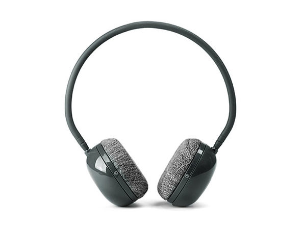
There are two main styles you need to know, the first being white background product photography. This is exactly what it sounds like: An image of a product, taken in a studio, that’s sitting or floating on a plain white background.

The second kind of product photography is known as a lifestyle shot, or a photo that shows a product in the context of its intended use. This type of imagery shows potential customers what they could be doing if they owned the featured product.

Which style of product photography is better for native commerce?
Both have their pros and cons, but generally, lifestyle shots lend themselves better to native commerce. Sure, those white-background photos are clean and easy to shoot, but they look really advertorial, which sort of defeats the purpose of a native article that’s supposed to blend seamlessly with the rest of your editorial content.
How can you tell a good product image from a bad one?
No matter their style, good product visuals are always high quality (i.e, they aren’t blurry or pixelated). We’ll let eCommerce guru Gregory Beyrouti explain: “With HD images, website visitors get to see the quality and details of the product in full,” he told a product photography firm last year. “It reassures them and might convince them to make the purchase. By contrast, a low-quality image looks amateurish and makes it much harder to get conversions when your competitors are doing a better job.”
Furthermore, a good product image will always jive with a publisher’s brand. For example: If you’re a luggage company that’s promoting your newest suitcase model on Mashable, you’ll want to use a lead image that features a young, hip person using said suitcase.
Want to learn more about honing your native commerce strategy, or how you can promote your products with StackCommerce? Click here to get in touch with our team.

