We’re excited to share a new look for StackCommerce!
We’ve come a long way since we were originally founded in 2011. What started out as a flash sale site for tech deals has grown into a powerful native commerce platform serving the world’s top online publishers and trending brands. We’ve evolved tremendously and we believe it’s time our look changed along with us.
![]()
The new logo and mark
Gone is the blue “stacked” icon we once borrowed from our owned-and-operated e-commerce shop, StackSocial, when we rebranded to StackCommerce back in 2014. In its place is a new logo which subtly encompasses a mark that better represents the heart of our mission: an infinity sign.
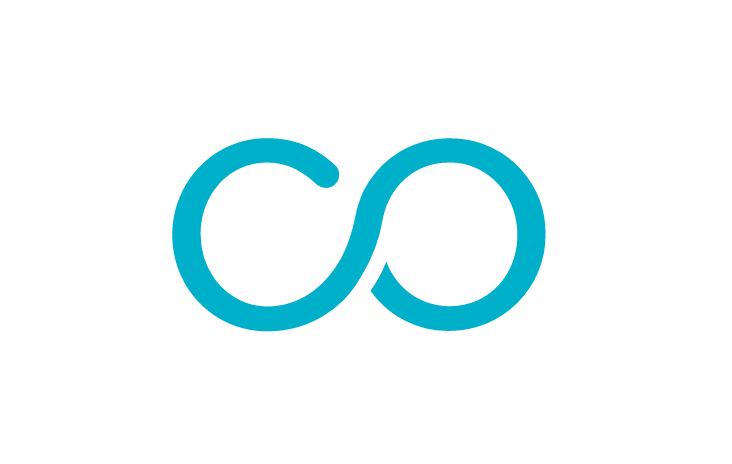
Woven together by the “c” and “o” in commerce, the infinity sign is the ultimate visual representation of the native commerce ecosystem we’ve built. Our platform facilitates limitless connections between our biggest stakeholders: content creators to publishers, publishers to brands, brands to audiences, audiences to unique offers, and ultimately unique offers back to content creators.
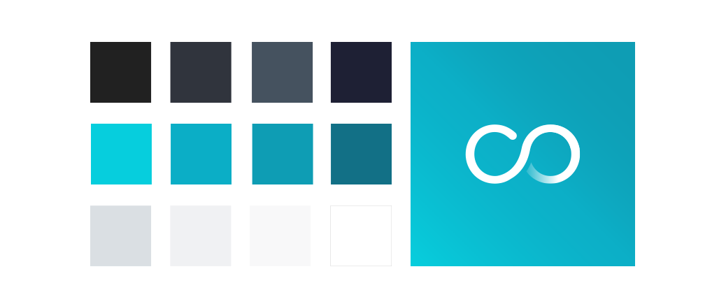
StackCommerce’s refreshed look and new color
While reflecting on our evolution from a B2C to a B2B company, we hoped to create a look that was better in line with the remarkable company we’ve built.
The biggest change you’ll notice is the transition to a new color. We felt a bright, bold teal hit the mark perfectly as a color that evoked much of the culture and work ethic we’ve established within our team. The perfect blend of blue’s confidence and green’s growth, teal beams with clarity and creativity. It says to the world that we’re not interested in simply fitting in with the crowd – and as a company that is not afraid to walk the uncharted path to success, we couldn’t feel more aligned.
Thank you for coming along this journey with us! We hope you enjoy our new look, and feel it celebrates the spirit of StackCommerce as much as we do.