We’re pretty big on bundles here at Stack. These unique curated sales are exclusive to our business, and allow our partners to offer customers amazing deals not found anywhere else on the Web. Last month we rolled out our new online course sale page, and based on that success, it was time to give our bundle sale page a facelift as well.
Our goal while redesigning our new bundle page was to give our users a better experience by highlighting important information and clearly showcasing the products. By diving into the most common customer service inquiries, we pinpointed the information that is most important in the user’s eyes. Then, we served it to them on a silver platter.
THE BREAKDOWN
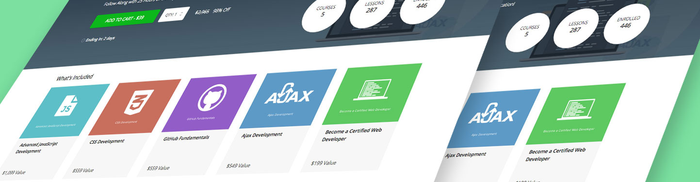
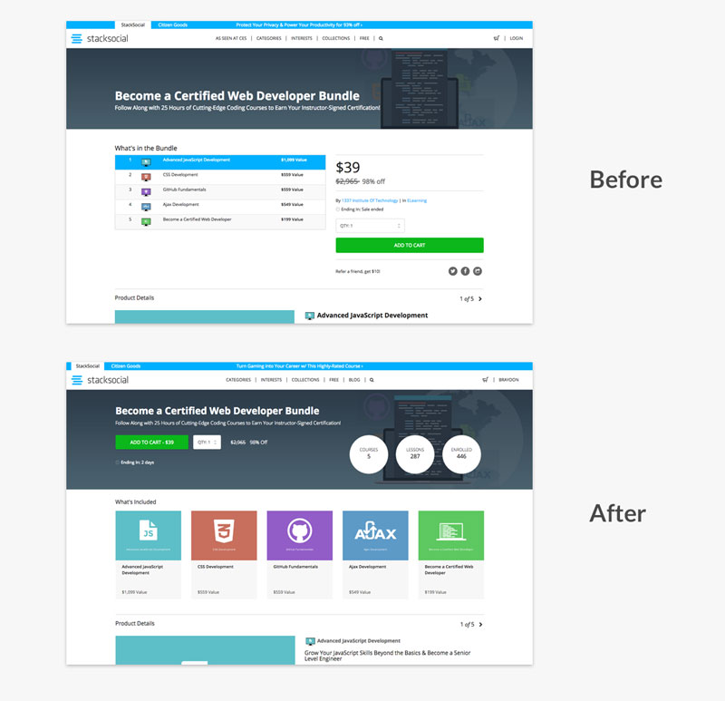
We started by bringing the most important elements up higher on the page so users would instantly know how many and which courses are included, without needing to scroll. The “Add To Cart” CTA was also moved up for immediate access. The result? The entire page was lifted, and now reveals the top part of the Product Details. This tells the users that there’s more content on the page.
We also made some significant improvements to the mobile experience. Before, the bundle page was essentially just a long, difficult-to-digest scrolling page.
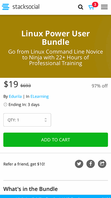
Like the desktop redesign, we brought up the most important information to give the user quick and easy access. Instead of featuring vertical bars for the items in the bundle, we built a horizontal scrolling container so the user can easily swipe left or right through the products and still see other important content on the page.

The redesign not only provides a cleaner visual experience, but has proven to be a better overall user experience for our customers and those of our partners. Since launching the new design, we have watched the conversion rate on bundle pages rise by over 12%!
Up next: sale page redesign for more product types!
Thanks for reading!
– Braydon on behalf of the Stack Product Team