On our StackSocial site, different product types require different page layouts. The two main layouts we use are designed for our bundle sales and single product sales. Last week we introduced a brand new page page layout tailored to our eLearning sales. This is significant for two main reasons: 1. eLearning is one of our largest product categories and 2. eLearning sales contain product details that are vital for the consumer, that are irrelevant for other product categories. With this update, we now have a layout that was built solely with an eLearning product in mind.
After doing some research, we decided that the eLearning layout should be built around two key features – a course outline and a preview video of the course.
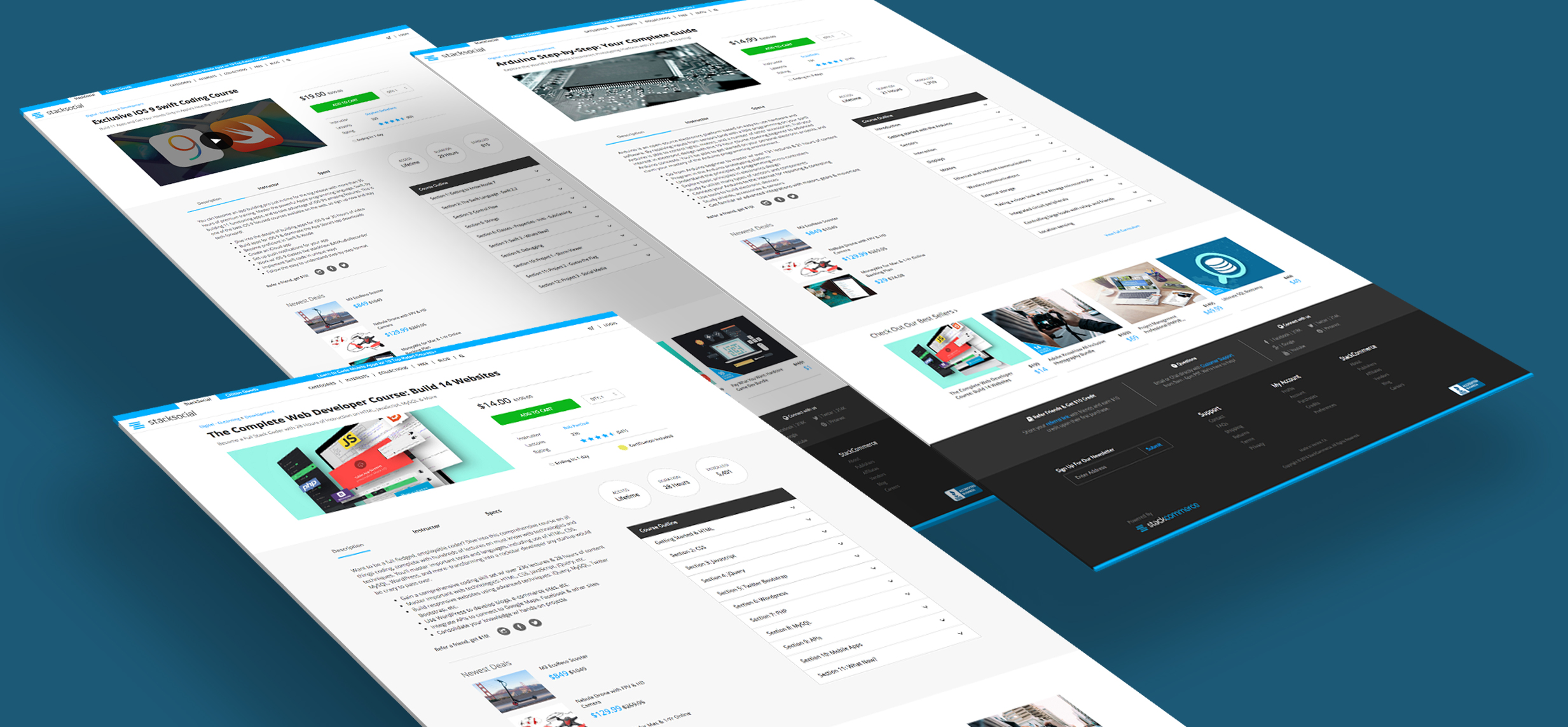
A before and after of our eLearning page updates:
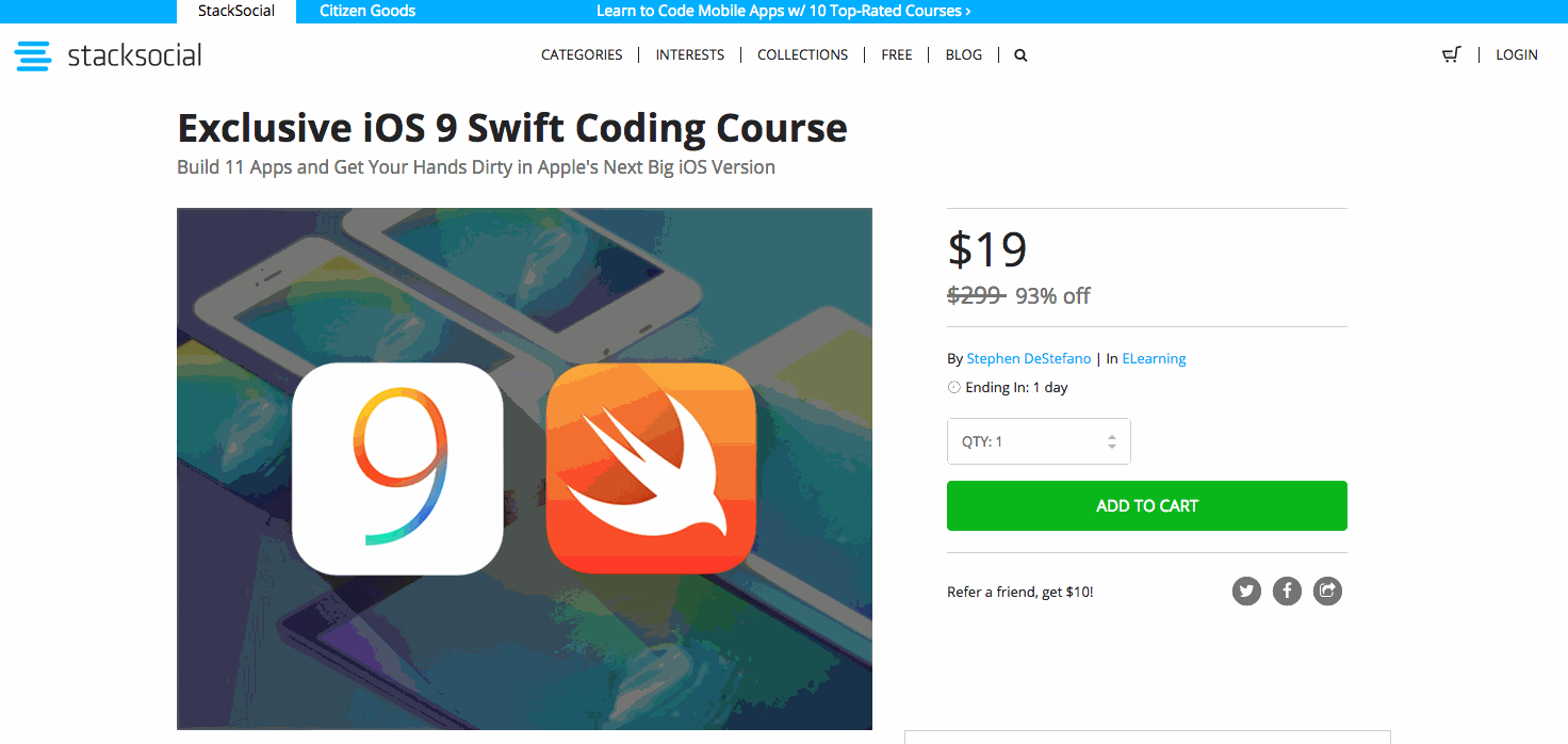
By adding a video we were able to use a wider image ratio allowing the rest of the page move up, above the fold. We also added eLearning specific information opposite from the video/product image which includes: Instructor name, number of lessons, and a star rating. Now all of the product detail tabs are above the fold which allows for fast consumption of important information on the page.
A look at the course outline:

The course outline was added to the page parallel to the description and other, with each section able to be expanded to show more course information. Now our users have more granular information on the course they are intending to buy.
With this new layout, we hope to give our users a better understanding of what’s offered in the courses we sell. In the next month we we hope to roll out redesigns for our eLearning bundle and ‘pay what you want’ pages and continue to improve the user experience across our platform.
Thanks for reading!
-Stack Product Team